Quick Guide
- What Are Flowers Blooming Early Graphs, Really?
- The Big Question: Why Are the Blooms Shifting?
- How to Actually Read and Interpret These Graphs
- What This Means for You and Your Garden
- Beyond the Garden: The Wider Ecological Impact
- Common Questions About Flowers Blooming Early Graphs
- The Bottom Line: More Than Just a Pretty Chart
You've probably seen them. Maybe on a news site, or shared by a science page on social media. Colorful lines crawling across a graph, with a title something like "Cherry Blossom Bloom Dates, 1950-Present." And that line, more often than not, is trending downwards. Earlier and earlier. These flowers blooming early graphs aren't just pretty pictures for data nerds. They're a direct, visceral report card from nature, and honestly, they're telling us a story we can't afford to ignore. I got hooked on these charts a few years back when my own daffodils, which my grandmother said were always an April event, started poking through in mid-March. It felt wrong. Was it just a warm spell, or something bigger? That's when I started digging into the data, and the world of phenology—the study of seasonal cycles in plants and animals—opened up.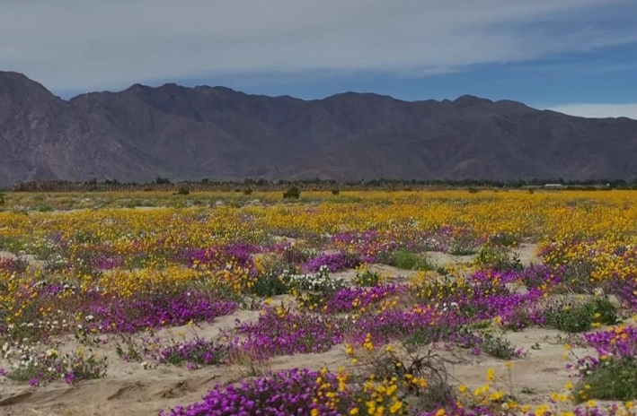
So, let's break down these graphs. What are they actually showing? Who makes them? And most importantly, what do they mean for your backyard, your local park, and the bigger picture of our environment?
What Are Flowers Blooming Early Graphs, Really?
At their core, these are visual plots of observation data. On one axis, you usually have time (years). On the other, you have the "phenophase" date—that's the fancy term for the day a specific event was recorded, like the first bloom of a lilac bush. Each dot is an observation for a year, and the line connects them to show the trend. A downward slope means the event is happening earlier in the year. An upward slope means later.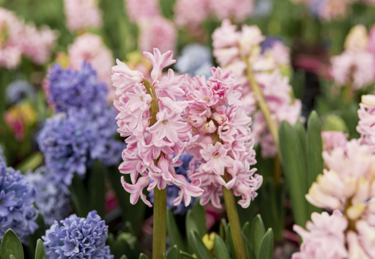
But not all flowers blooming early graphs are created equal. Some track a single, famous specimen (like a specific cherry tree in Washington D.C.). Others show an average across a whole region or species. This distinction is huge. One tree might be influenced by local factors like urban heat (cities are warmer, making things bloom sooner), but a regional average points to a broader climate signal.
Where Does This Data Even Come From?
This is the cool part. The data comes from two main sources, and both are crucial.
- Long-Term Scientific Records: These are the gold standard. Institutions like botanical gardens, universities, and weather services have been meticulously recording bloom dates for decades, even centuries. The USA National Phenology Network (USA-NPN) is a key hub, compiling data from professionals and the public. In Japan, the records for Kyoto's cherry blossoms go back over 1,200 years! That's an incredible dataset for spotting trends.
- Citizen Science: This is where regular folks like you and me come in. Projects like Nature's Calendar in the UK or the USA-NPN's "Nature's Notebook" rely on volunteers to report what they see in their gardens and neighborhoods. It creates a massive, ground-level dataset that scientists alone could never gather. I signed up a few years ago, tracking the maple in my yard. It’s surprisingly satisfying, and it makes you look at your garden differently.
When you look at a well-made flowers blooming early graph, you're often looking at a blend of these data sources, painstakingly cleaned and analyzed.
The Big Question: Why Are the Blooms Shifting?
The short, overwhelming answer is climate change. But let's be more specific, because it's not just about warmer annual temperatures. It's about the nuance of spring.
Plants, especially perennial ones that bloom in spring, rely on a complex set of cues to wake up from dormancy. They need a period of winter chilling (cold temperatures) to properly reset. Then, as days lengthen and temperatures warm in spring, they get the signal to burst forth. The problem is, our winters are getting warmer, and our springs are arriving sooner and sometimes more erratically.
This isn't just theory. Studies using these very graphs have shown clear advances in spring phenology across continents. The U.S. Environmental Protection Agency uses leaf and bloom indices as official climate change indicators. When government agencies start graphing bloom times, you know it's moved beyond academic interest.
How to Actually Read and Interpret These Graphs
Okay, so you're looking at one of these charts. Don't just glance at the headline. Here's what to look for to be a savvy interpreter.
| Graph Element | What to Look For | Why It Matters |
|---|---|---|
| The Trend Line | Is it sloping down (earlier), up (later), or flat? How steep is the slope? | This shows the overall direction and speed of change. A steep downward slope = rapid advancement. |
| Data Points (The Dots) | Are they tightly clustered around the line, or widely scattered? | Scatter shows high year-to-year variability. A warm March one year, a cold April the next. The trend is the average through this noise. |
| Time Scale | How many years does the graph cover? 30 years? 100? | Longer records reveal more robust trends. A 10-year trend might just be natural variation; a 50-year trend is more compelling. |
| What's Being Measured | "First bloom" vs. "Full bloom." A specific tree vs. a species average. | "First bloom" is more sensitive to early warm spells. A species average is more representative of the population. |
| Location | Is it an urban park, a rural forest, a specific latitude? | Urban heat island effect can exaggerate trends. Comparing urban and rural flowers blooming early graphs can isolate the climate signal. |
One personal gripe: I sometimes see graphs shared without clear sourcing. A graph without a citation is just a picture. A good graph will cite its data source, like "Data: USA National Phenology Network" or "Source: Royal Botanic Garden, Edinburgh." Trust those. Be skeptical of the ones that don't.
What This Means for You and Your Garden
This is where it gets practical. Those flowers blooming early graphs aren't just about far-off forests. They have direct implications for your gardening success.
Traditional gardening calendars are becoming less reliable. Planting by a fixed date ("Plant peas on St. Patrick's Day") is riskier if last frost dates are shifting. Instead, we need to become better observers of our own local conditions—backyard phenologists, if you will.
- Pest and Disease Pressure: Warmer, longer springs can mean more generations of pests like aphids or certain fungi. An early-blooming plant might get hit by pests that also emerged early.
- Pollinator Problems: This is the classic "phenological mismatch." If a bee species times its emergence based on day length, but its favorite flower blooms based on temperature, they might miss each other. The bee goes hungry, the flower doesn't get pollinated. It's a silent breakdown in the system.
- Watering Needs: Earlier growth means earlier water demand. If spring rains don't adjust accordingly, you might need to start watering sooner.
So what can you do?
Actionable Steps for the Climate-Aware Gardener
- Start a Garden Journal: Note the dates. First daffodil bloom. First frost. When the lilac leaves unfurl. Over just a few years, you'll create your own personal flowers blooming early graph. It's powerful.
- Emplant Diversity: Don't put all your eggs in one basket. Plant a variety of species that bloom at different times and have different tolerances. Native plants are often better synchronized with local pollinators and climate patterns.
- Protect Against Frost: Have frost cloth handy in early spring. If you've planted tender things and a late frost is forecast, be ready to cover them. That early bloom is a gamble.
- Join a Citizen Science Project: Contribute your observations! Your data point, combined with thousands of others, helps build the very graphs that inform science. Check out Nature's Notebook or similar projects in your country.
Beyond the Garden: The Wider Ecological Impact
The ripple effects of shifting bloom times extend far beyond our fence lines. Think about migratory birds that fly thousands of miles to arrive at a breeding ground timed for a insect hatch that depends on specific plants blooming. If the blooms are early, the insects peak early, and the birds arrive to an empty pantry.
Forest ecosystems are built on intricate timing. The period after snowmelt and before canopy closure is a critical window for certain wildflowers. If that window shifts, it can change the competitive balance in the forest floor. When you look at a regional flowers blooming early graph, you're potentially looking at a catalyst for ecosystem-wide change.
This isn't fear-mongering; it's systems thinking. Phenology is the clockwork of nature. When the clock runs fast, the gears start to grind.
Common Questions About Flowers Blooming Early Graphs
The Bottom Line: More Than Just a Pretty Chart
At the end of the day, these flowers blooming early graphs are a bridge. They bridge the abstract concept of a warming global average temperature (a number that's hard to feel) with the concrete, beautiful reality of a flower in your garden. They translate global change into local observation.
They tell us that the seasons we grew up with are not the seasons our gardens are experiencing now, and certainly not the seasons our children will inherit. Understanding these graphs is the first step in adapting—as gardeners, as nature lovers, as a society. We can't manage what we don't measure, and these graphs are a fundamental measurement of our changing world.
So next time you see one, take a closer look. Think about the data behind it. Maybe even start contributing a point on that graph yourself. It’s one of the most direct ways to connect your little patch of earth to the biggest story of our time.